Neural Spline Flow Tutorial
![]()
This notebook is intended as an example of usage of the NeuralSplineFlow class from spqr module, where we have trained the bijector to replicate a simple 2-D feature distribution.
This notebook is divided in the following sections:
introduction;
creation of a toy dataset and a few helper functions;
initializing a NeuralSplineFlow bijector;
training;
results and conclusion.
1. Introduction
A normalizing flow is a bijective and differentiable transformation \(g_{\theta}\), which can map a vector of features with D-dimensions \(x\) in a transformed vector \(g_\theta(x) \sim z\) with D-dimension. Since the transformation \(g\) is differentiable, the probability distribution of \(z\) and \(x\) are linked through a simple change of variable:
Hence the name normalizing, because the probability is conserved.
The parameters \(\theta\) can be trained to map a simple distribution \(p(z)\) (tipically a gaussian) into the feature distribution \(p(x)\) through the inverse transformation \(g_\theta^{-1}\).
Following the idea in the article Durkan et al., we have implemented a normalizing flow transformation which uses as bijector a rational quadratic spline. To learn the correlation between features (improves the expressivity of the transformation) and to avoid a too large computation time for the Jacobian, bijectors must be composed in chain allowing at each step some variables to be unchanged. The algorithm we use to this purpose is a RealNVP.
Package required to run this notebook
First, we need to import the required packages.
[1]:
import sys
sys.path.append('../../../src/')
import time

import numpy as np
import pandas as pd
from matplotlib import pyplot as plt
import seaborn as sns # plot package
import sklearn.datasets as skd # where we can find a simple example
import tensorflow as tf
from tensorflow_probability import bijectors as tfb
from tensorflow_probability import distributions as tfd

from spqr import NeuralSplineFlow as NSF
2. Toy dataset
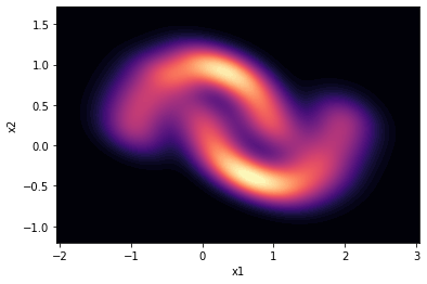
We load a simple dataset from sklearn.datasets, moons. This dataset is often used (FFJORD demo) to illustrate the functioning of a normalizing flow.
We also define in this section a function to plot data and visualize them nicely.
[2]:
BATCH_SIZE = 256
DATASET_SIZE = BATCH_SIZE * 2
SAMPLE_SIZE = DATASET_SIZE

# load the dataset
moons = skd.make_moons(n_samples=DATASET_SIZE, noise=.06)[0]
# transform the dataset to a `tf.data.Dataset` object for autobatching,
# multiprocessing, speed up etc...
moons_ds = tf.data.Dataset.from_tensor_slices(moons.astype(np.float32))
moons_ds = moons_ds.prefetch(tf.data.experimental.AUTOTUNE)
moons_ds = moons_ds.cache()
moons_ds = moons_ds.batch(BATCH_SIZE)

moons = pd.DataFrame(moons, columns=['x1', 'x2'])

# let's visualize the moons dataset. which our algorithm will
# hopefully learn to reproduce
sns.kdeplot(data=moons, x='x1', y='x2',
            cmap='magma', fill=True,
            thresh=0, levels=100)
[2]:
<AxesSubplot:xlabel='x1', ylabel='x2'>
Plot helper function
Now let’s define a plot function suited to our purpose of visualizing training progress of the algorithm.
[3]:
def plot(trans_sample,
         counter,
         nfeatures=2):
    """
    Plot function to display results. More sample can be plotted
    on the same figure. We use it to plot a sample from the
    transformed distribution and compair it to the moon datasample

    """
    # plot the moon dstribution
    ax_s = sns.kdeplot(data=moons, x='x1', y='x2',
            cmap='magma', fill=True,
            thresh=0, levels=100)

    # split trans_sample data into single features
    x_s, y_s = np.squeeze(np.split(trans_sample, nfeatures, axis=1))
    # add a scatterplot of the trans_sample
    ax_s.scatter(x_s, y_s, color='yellow', alpha=0.6)

    ax_s.set(xlim=(-2, 3), ylim=(-1.1, 1.6))
    ax_s.set_title(f'training epoch = {counter}')

    # save the figure
    name = f'training_fig{counter}.jpeg'
    plt.savefig(name)
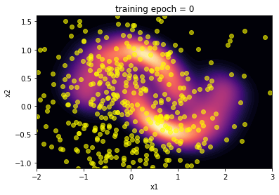
3. Initialization of NSF
We initialize the NeuralSplineFlow bijector and define a base distribution \(z\) as a multivariate normal distribution with \(\mu = [0, 0]\) and cov = $
$
Then, we plot the inverse distribution of the bijector before any training and compair it to the moon distribution. Hopefully the algorithm will learn to reproduce this distribution after training.
[4]:
neural_spline_flow = NSF(splits=2) # with 2 features 2 splits is enough

base_loc = np.array([0.0, 0.0]).astype(np.float32)
base_sigma = np.array([1., 1.]).astype(np.float32)
base_distribution = tfd.MultivariateNormalDiag(base_loc, base_sigma)
transformed_distribution = tfd.TransformedDistribution(distribution=base_distribution,
                                                       bijector=neural_spline_flow)

# plotting
plot(transformed_distribution.sample(SAMPLE_SIZE), 0)
plt.show()
4. Model training
We define a train step function following the keras example. With a normalizing flow it is straightforward to choose the objective function to minimize:
[5]:
@tf.function
def train_step(optimizer, target_sample):
    with tf.GradientTape() as tape:
        loss = -tf.reduce_mean(transformed_distribution.log_prob(target_sample))
    variables = tape.watched_variables()
    gradients = tape.gradient(loss, variables)
    optimizer.apply_gradients(zip(gradients, variables))
    return loss
We are ready to perform the training!
[6]:
t0 = time.time() # to calculate training time
# hyper parameters for the training
LR = .6e-3
NUM_EPOCHS = 300
learning_rate = tf.Variable(LR, trainable=False)
optimizer = tf.keras.optimizers.Adam(learning_rate)
loss = 0
val_loss = 0
# history of training loss
history = []
fig_list = []
# Training loop
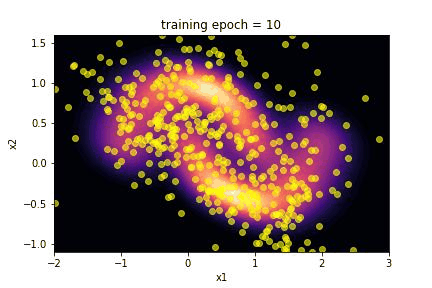
for epoch in range(NUM_EPOCHS):
if epoch % 10 == 9:
fig_name = f'training_fig{epoch + 1}.jpeg'
fig_list.append(fig_name)
plot(transformed_distribution.sample(SAMPLE_SIZE), epoch + 1)
for batch in moons_ds:
loss = train_step(optimizer, batch)
history.append(loss)
t1 = time.time()
train_time = t1 - t0
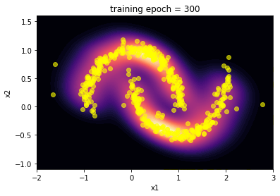
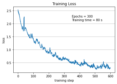
5. Results …
Here we summarize the results of the training:
Using the
make_giffunction we realize a gif of the evolution of the transformed distribution during training;we plot the history of the loss during the training.
[7]:
from plot_utils import make_gif

# gif showing training across epochs
make_gif(fig_list, output_gif="spqr.gif")
[8]:
# Now we plot loss across epochs
plt.title('Training Loss')
plt.plot([i for i in range(len(history))],
        history)
plt.xlabel('training step')
plt.ylabel('loss')
plt.grid(axis='y')
plt.text(350, 2.1, f'Epochs = {NUM_EPOCHS} \nTraining time = {train_time:.0f} s')
plt.savefig('train_loss_spqr.png')
plt.show()
… and conclusions
The capability of the SpQR algorithm to reproduce the toy moon distribution is evident looking at the images of the comparison between the two distributions.
The “visual” effect is actually a good way to evaluate this algorithm, since it is often applied in image generation as an alternative to GAN. Craving for a little more quantitative, we performed a Kolmogorov-Smirnov test on the marginalized distribution of the two features x1 and x2.
[13]:
from scipy.stats import ks_2samp

# getting samples
TEST_SIZE = 1000
trans = transformed_distribution.sample(TEST_SIZE)
#slicing and preparing arrays to perform the test
x1_trans, x2_trans = np.squeeze(np.split(trans, 2, axis=1))
x1_moons, x2_moons = np.squeeze(np.split(moons.to_numpy(), 2, axis=1))

# calculating statistic from K-S test and p-values
stat_1, pval_1 = ks_2samp(x1_trans, x1_moons)
stat_2, pval_2 = ks_2samp(x2_trans, x2_moons)

print(f'p-value x1 distribution = {pval_1}')
print(f'p-value x2 distribution = {pval_2}')
p-value x1 distribution = 0.6407855506440566
p-value x2 distribution = 0.9831250260206603
The p-value for the two tests are better than 0.5. At least, this means that the algorithm learnt quite well to simulate the two features distributions.